1.12.14
Transformers 4 - Movie concept exploration 1


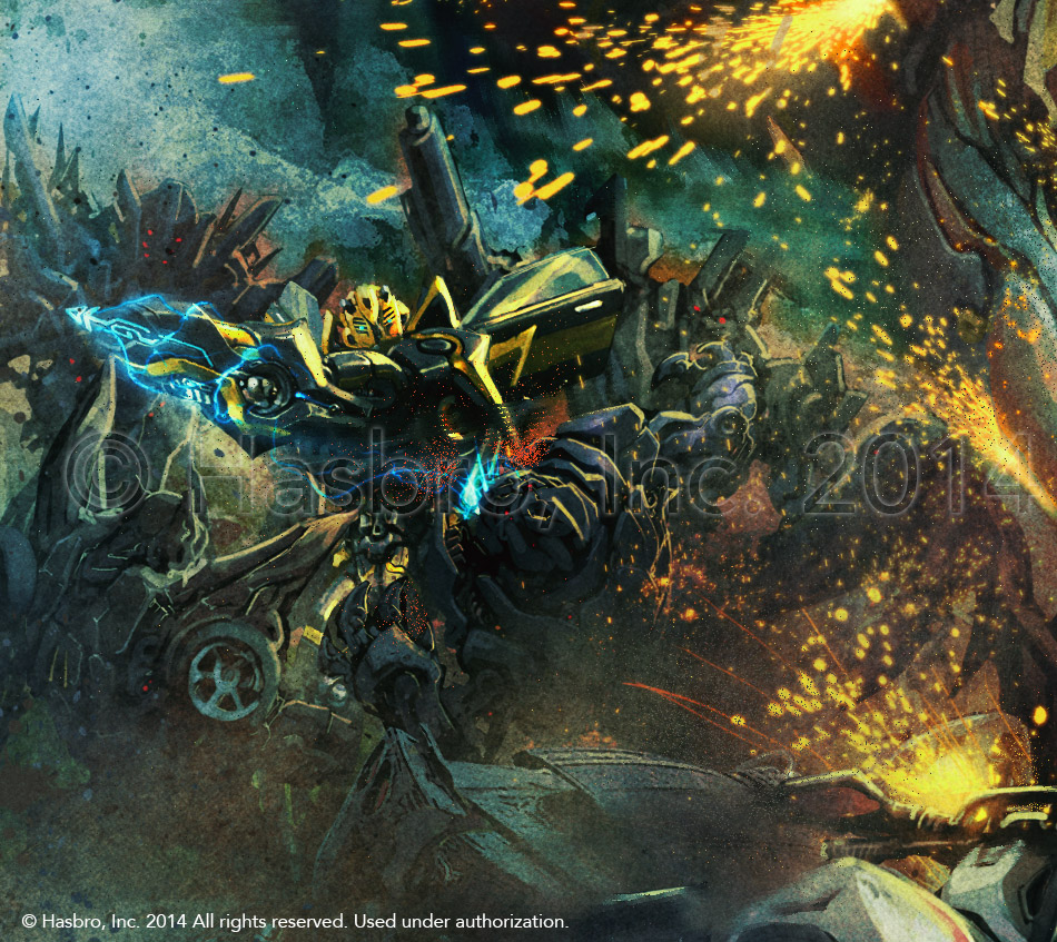
Just a couple of months ago I received approval on showing at least one piece of the work I did for Transformers Age of Extinction movie.
This is one of the craziest piece I did for the fourth Transformers movie and it was a lot of fun to work on.I did it under the direction of the mighty Aaron Archer who gave me a ton of details to fit into one single image.
I started with a couple of simple composition/mood studies, and then went into the full rendering.


I loved adding all the dust and atmospheric elements, creating chaos during the battle.
There is so much going on that something can get lost, like Bumblebee fighting a bunch of Decepticons behind Grimlock.
There will be more? The title of the post suggests yes, as I did several other pieces, so, hopefully I'll get permissions to show some others in the following years.
10.11.14
My dream MOTUC Signature Series collected
Originally appeared on Facebook as daily posts, I decided to collect this series of MOTU concepts on my blog as well, so you can see them all in one place at once.
With all the talks about a possible rebrand of the Classics line of figures for 2016, I wanted to explore what I would personally like to see.
I then created a series of B-Sheets portraying a line-up of figures, based on MOTUC molds, but reworked to offer new versions of the main characters, offering a jump-in point for new collectors. Released as a full year line, they would probably work mixed with other unreleased characters, appealing to the existing MOTUC collectors too.
Going by the name of the line "Signature Series", a name mentioned by the former MOTU brand manager echoing the latest DC Signature Series, I envisioned a line of figures that pay a big homage to the original creators of the line. Most of the figures I sketched are redesigned to reflect as much as possible the original B-Sheets that Mark Taylor created in 1981.
Which mean, they are not really my own designs, but they are what originally generated MOTU, as Mark was the creator of all the main characters.
Mind you, you may not recognize some of this stuff, or think some of the color scheme are pretty arbitrary. They are not. Everything is based on the original Mark's colored drawings I had the privilege to see a couple of years ago and that hopefully will be published in one of the future The Power and The Honor Foundation publications.
But why not go completely wild and just design figures that look exactly like the b-sheets, with different bodies etc.? Because I tried to design a complete and affordable line up of figures that could be released over the course of an entire year and remain affordable especially since this would be what rebranding means: bringing back main characters for people that missed out, but using most of the existing molds and changing line name and packaging
That also means, some figures have more new tooling, and cost more, some would have less, and cost less but help fitting the higher-tooling ones in the budget.
It’s how MOTUC worked since day one.
A few extra notes: rebranding the line means mostly the following things:
-Refreshing the “appearances" of the line, by changing mainly the line name and the packaging.
-Reusing as much as it’s possible existing tooling
-Bringing back the main characters.
You may not want that because you already have them, but that is not how the marketing works for those things. A “rebranded” line will supposedly try to catch up with collectors that didn’t buy this line in the first place, or that got into it too late and can’t find or afford the first releases anymore, all this while appealing to a portion of the existing customer that will buy again the main characters.
Now, mine is just an idea of many possible. I approach it with a very nostalgic and historical eye. I don’t think this is the best possible, it’s just what I’d love most.
Also, this idea was originally what I would have loved for the 30th anniversary line.


With all the talks about a possible rebrand of the Classics line of figures for 2016, I wanted to explore what I would personally like to see.
I then created a series of B-Sheets portraying a line-up of figures, based on MOTUC molds, but reworked to offer new versions of the main characters, offering a jump-in point for new collectors. Released as a full year line, they would probably work mixed with other unreleased characters, appealing to the existing MOTUC collectors too.
Going by the name of the line "Signature Series", a name mentioned by the former MOTU brand manager echoing the latest DC Signature Series, I envisioned a line of figures that pay a big homage to the original creators of the line. Most of the figures I sketched are redesigned to reflect as much as possible the original B-Sheets that Mark Taylor created in 1981.
Which mean, they are not really my own designs, but they are what originally generated MOTU, as Mark was the creator of all the main characters.
Mind you, you may not recognize some of this stuff, or think some of the color scheme are pretty arbitrary. They are not. Everything is based on the original Mark's colored drawings I had the privilege to see a couple of years ago and that hopefully will be published in one of the future The Power and The Honor Foundation publications.
But why not go completely wild and just design figures that look exactly like the b-sheets, with different bodies etc.? Because I tried to design a complete and affordable line up of figures that could be released over the course of an entire year and remain affordable especially since this would be what rebranding means: bringing back main characters for people that missed out, but using most of the existing molds and changing line name and packaging
That also means, some figures have more new tooling, and cost more, some would have less, and cost less but help fitting the higher-tooling ones in the budget.
It’s how MOTUC worked since day one.
A few extra notes: rebranding the line means mostly the following things:
-Refreshing the “appearances" of the line, by changing mainly the line name and the packaging.
-Reusing as much as it’s possible existing tooling
-Bringing back the main characters.
You may not want that because you already have them, but that is not how the marketing works for those things. A “rebranded” line will supposedly try to catch up with collectors that didn’t buy this line in the first place, or that got into it too late and can’t find or afford the first releases anymore, all this while appealing to a portion of the existing customer that will buy again the main characters.
Now, mine is just an idea of many possible. I approach it with a very nostalgic and historical eye. I don’t think this is the best possible, it’s just what I’d love most.
Also, this idea was originally what I would have loved for the 30th anniversary line.
15.8.14
Transformers Generations Rattrap
Yet another of my Transformers Generations figure designs!
Transformers Generations Rattrap! This was done shortly after Rhinox, Waspinator and Cosmos, and I got to do only the Robot mode. But it's one of my favorite sketches and I love how the toy turned out!


Transformers Generations Rattrap! This was done shortly after Rhinox, Waspinator and Cosmos, and I got to do only the Robot mode. But it's one of my favorite sketches and I love how the toy turned out!
7.7.14
The Covenant of Primus: Megatron
When The Covenant of Primus was released, the Megatron design I had done for the Transformers Binder of Revelations was finally revealed.
This piece of concept art was originally done in 2009, as part of the new TF brand bible.
Once more I was working under Eric Siebenaler's directions along with Aaron Archer's (whow, it was so much time ago that my memories are starting to fade away!).
Under those directions, I created it blending elements from a previous sketch I had done and another artist's ideas (the blacked out face and the axes on the back).
The concept was first only used fort the bible, but it was then sent out as reference for other media. He was the model we used for The Ultimate Pop-Up Universe and the one the other artists used for the Covenant of Primus illustrations, where it also appeared in tis full glory.
I didn't get to do the Alt Mode, which was done by Ken Christiansen and can be seen here.
As a bonus, here is also the "pencil" sketch. From that one I went straight to color devising the technique that I would have later used on the Pop-Ups. But at that time, this took me 4 days!


This piece of concept art was originally done in 2009, as part of the new TF brand bible.
Once more I was working under Eric Siebenaler's directions along with Aaron Archer's (whow, it was so much time ago that my memories are starting to fade away!).
Under those directions, I created it blending elements from a previous sketch I had done and another artist's ideas (the blacked out face and the axes on the back).
The concept was first only used fort the bible, but it was then sent out as reference for other media. He was the model we used for The Ultimate Pop-Up Universe and the one the other artists used for the Covenant of Primus illustrations, where it also appeared in tis full glory.
I didn't get to do the Alt Mode, which was done by Ken Christiansen and can be seen here.
As a bonus, here is also the "pencil" sketch. From that one I went straight to color devising the technique that I would have later used on the Pop-Ups. But at that time, this took me 4 days!
17.6.14
Generations Metroplex
Wow, it was almost an year ago... When Transformers Generation Metroplex went on sale and also made an appearance as an exclusive at San Diego Comic Con.
As some of you may know, I did some work on that giant sucker. But I didn't do the whole design. What I did was working with Chris Hicks on a concept to pitch the idea and work out the general shapes and features. After that, he was properly designed and engineered, but as you may notice, some spots remained faithful to what I had draw, like the chest area. As you can see also, those panels on the shoulders were supposed to open up. Hasbro kept them, but they are now part of the shoulder sculpture and don't move.
Overall, I believed I had to go for TF Prime aesthetic, I wasn't aware this was for Generations.
Oh, and yes, it's a pretty rough sketch. But many of these things starts like that!


As some of you may know, I did some work on that giant sucker. But I didn't do the whole design. What I did was working with Chris Hicks on a concept to pitch the idea and work out the general shapes and features. After that, he was properly designed and engineered, but as you may notice, some spots remained faithful to what I had draw, like the chest area. As you can see also, those panels on the shoulders were supposed to open up. Hasbro kept them, but they are now part of the shoulder sculpture and don't move.
Overall, I believed I had to go for TF Prime aesthetic, I wasn't aware this was for Generations.
Oh, and yes, it's a pretty rough sketch. But many of these things starts like that!
Subscribe to:
Posts (Atom)